OpenGL Audio Visualizer
Software
Written in C with OpenGL
GLSL Shaders
Sound data analyzed with fmod library
Description
Sound Waves
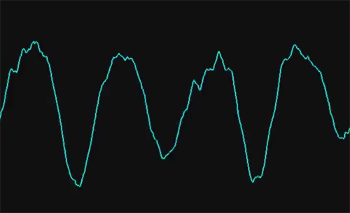
The first display shows the sound wave. The amplitude of the wave represents the power of the wave at that exact moment in time. You can think of it as the volume of the wave. When the waves are really close together, the tone is high pitched. When the waves are farther apart, the tone is lower. We can get a broad idea about the nature of sound by viewing it's waveform, but with a little further analysis we can understand even more.
Frequency Spectrum
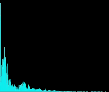
The previous section described a sound wave in terms of how the wave changed during a short period of time. You can also think of a sound wave as being composed of an infinite number of other waves, each vibrating at a different frequency. If you graph those frequencies you get a frequency spectrum. You'll notice that at this moment in the music most of the sounds is made up of lower frequencies. That is because this is a linear frequency spectrum, meaning from left to right on the diagram the frequencies increase at a constant rate. However, that's not how our ears understand sound. Our ears hear sound logarithmically, which means a frequency has to be doubled each time we increase an octave. For example, on the piano, A3 is 220 Hz, A4 is 440 Hz, and A5 is 880 Hz (if it were linear we would expect A5 to be 660 Hz). So, we can transform the data again to understand even more information.
8 Band Logarithmic Frequency Spectrum
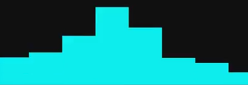
In this diagram, I transformed the data so that it fits in a logarithmic scale. The frequencies have been grouped into 8 equal groups. So, when there is a really low note in the music the left most bands will be appear really high. When there are high pitched notes, the right most bands will be really high. This is cool, because if we were to track the movement of these bands we could discover when impulses, or beats, occur in the low, high, and mid-tone notes!
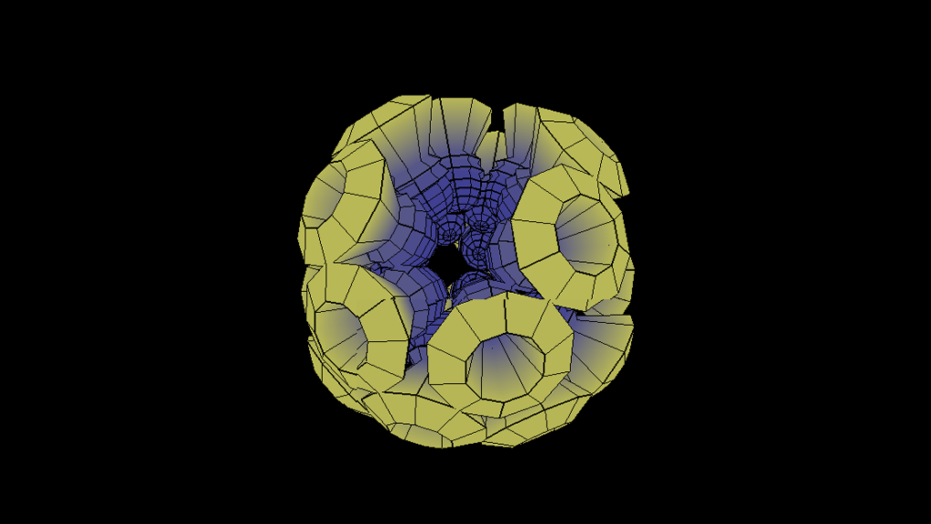
Audio Visualizer
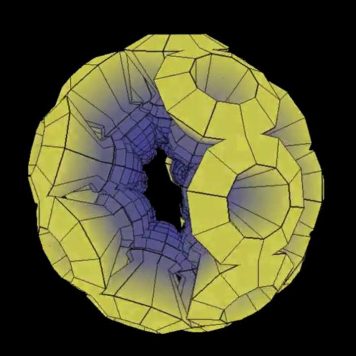
It's interesting to see this data expressed in terms of graphs, but I thought it would be cool to make a more interactive display. The above object contains several spheres which are essentially copies of each other. The spheres have 8 segments, each of which corresponds to a band in the previous graph. The segments expand based on the power of each of the bands. The shader colors the pixels purple when they are zero, and they get increasingly yellow as they move away from the origin.

